
Exploring light in creative spaces
Newsletter vol. 09
SEP. 2025

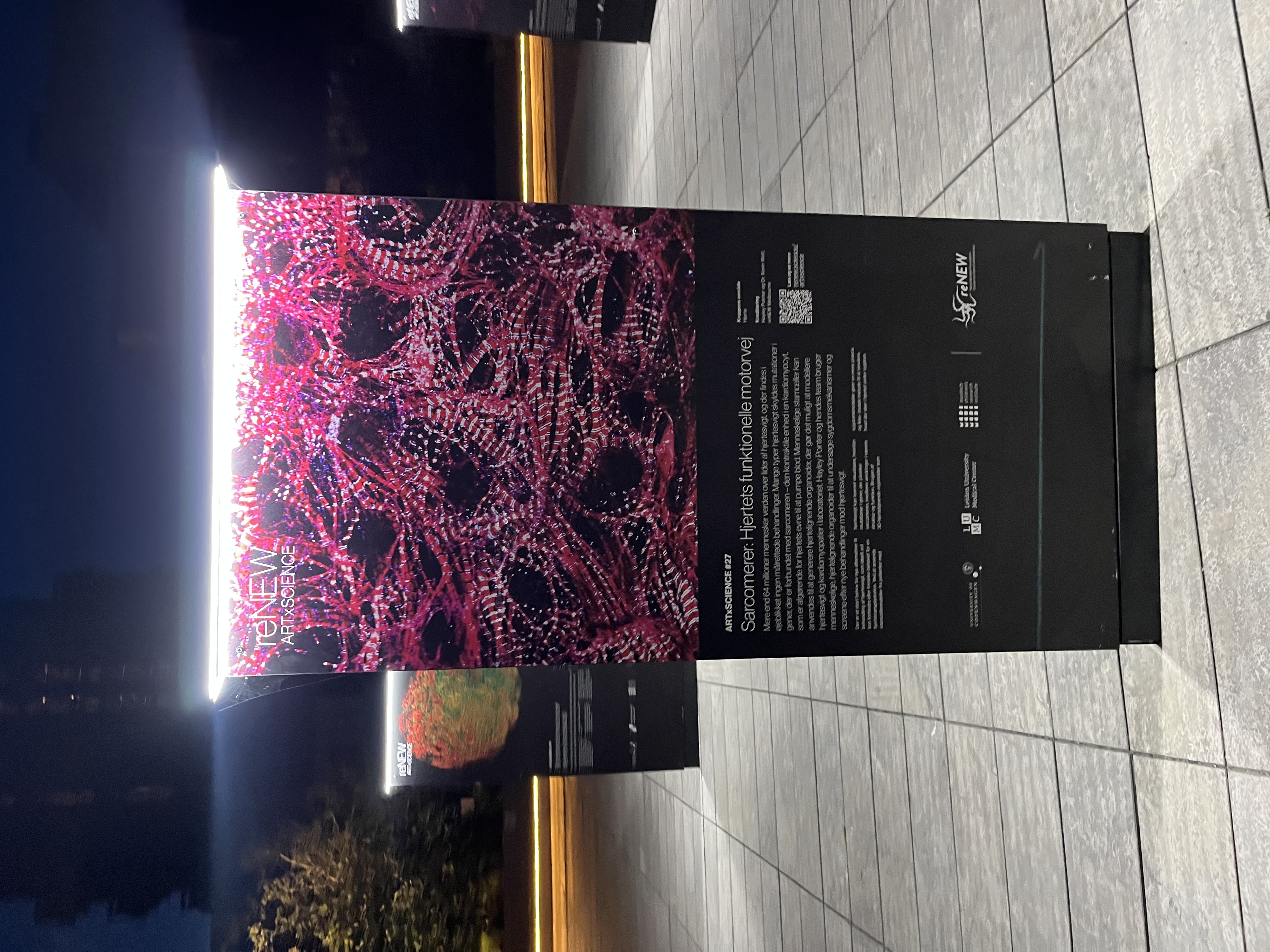
Light installations for reNEW


TOOLS FOR CHOOSING COLOUR


If you’ve ever had to make a colour palette for anything, you’re gonna love this tool. At coolors.co you simply hit the spacebar to create the perfect palette or get inspired by thousands of beautiful colour schemes.
More into having your palettes right at hand? We have a book recommendation for you. A dictionary of color combinations offers 348 color combinations, as attractive and sensuous as the book’s own design.
Talking about showing your true colours: learn incredible stories behind famous, ugly, and life-saving colours from The Ongoing Index of Curious Colors by Ben Schwartz and Laurenz Brunne.


